


As regular readers here know, I’ve been writing another book online, this one a special report relating to the latest research on those being called the “dones”, those who are giving up on the traditional congregational model for church and are looking for more relational realities. This series is designed to help people understand what’s being going on for the past twenty-five years or more while inviting the body of Christ from all her expressions to an expanding conversation about the nature of the church and its unity in our day.
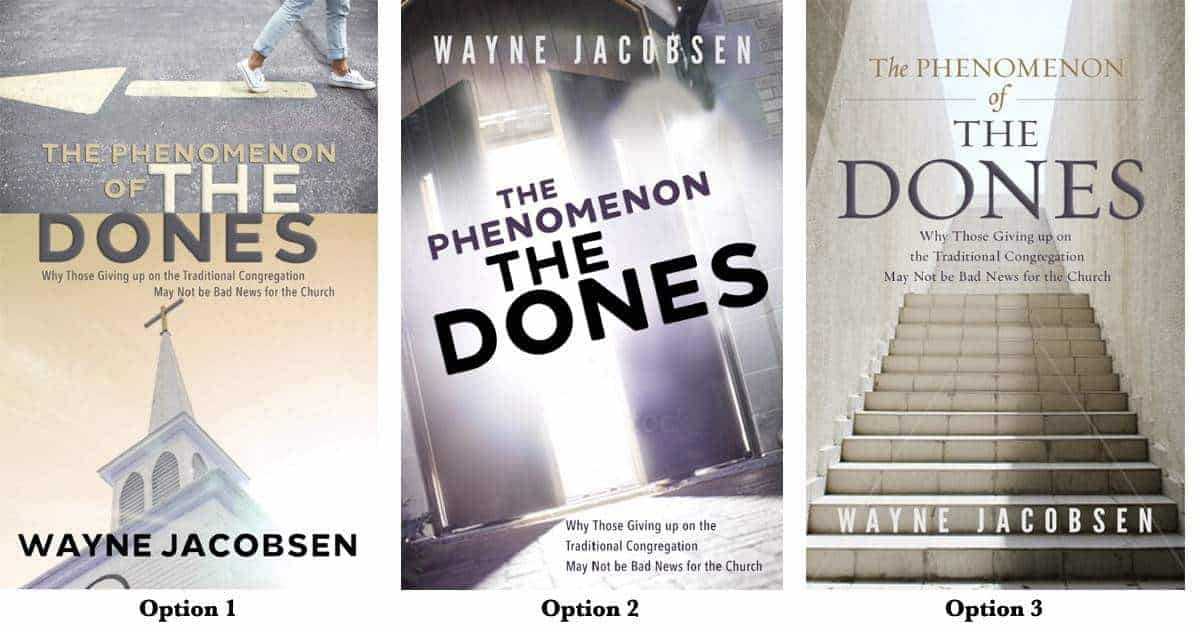
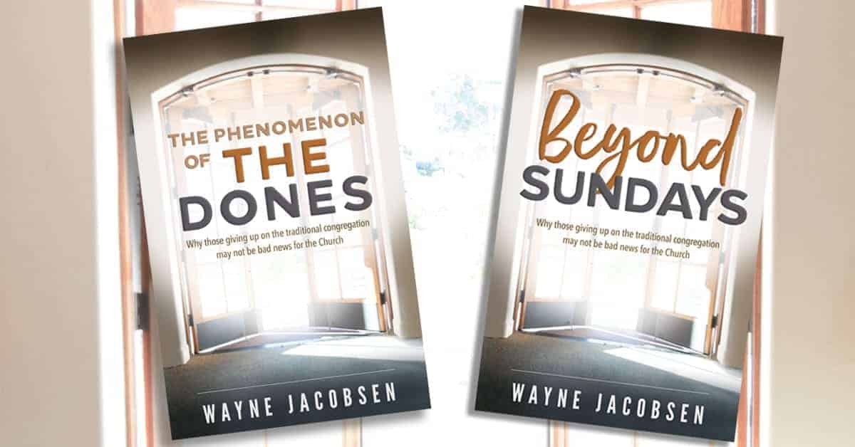
Those are going to be combined into a book and since I’m getting toward the end we are working on a cover for that book. Last time, readers of this blog and those who “like” its Facebook page provided some helpful input to sort out a cover for Finding Church: What if There Really Is Something More? This isn’t a vote to decide, but a chance to hear which cover resonates with you and why, which is very helpful for us in crafting a final cover that will serve the project well.
My hope for this book is that it will invite all followers of Jesus Christ into a better dialog about the nature of his work in the world. I don’t want to see yet another division among those who are learning to live in Father’s love, this one between the “dones” and “undones.” We have to see the life of Jesus as larger than the specific way we might encounter his church. For those who attend a local congregation and for those who are finding life in his church beyond it, we need a better conversation that coincides with Jesus’ prayer that the Father would make us all one, even as Jesus and his Father are one.
If you’ve missed this series of blogs, you can find the links on my latest in the series.
Take a look at the covers above. Which do you prefer and why? What would make it better? You can comment on the blog, my Facebook page, or email me with your comments.
Thanks for your help. You all make a pretty incredible focus group.


I like the first one. I think it will be picked up by more institutionalized believers. Pairing the church building with the title The Dones, says enough to pique their interest because they probably all know someone who is done with it all. Or if, like me, they are one of the Dones, it will strike a chord with them, and they’ll want to hear about others in the same boat.
I like the first cover for several reasons. The image of the church immediately “clicked” with me as to the context. And I love the person walking away from the direction of the arrow – brilliant as that is exactly how I felt when we began our journey out: going against the grain, and somewhat alone. As a side note, I prefer the font used on option 3… the best way I could describe my reaction to the different fonts is this: the font used on options 1 & 2 feels like a label given by someone else – makes me think of an old-fashioned rubber stamp, government-file type of stamp. The font on option 3 gives me more a feeling that the term is one in which I can take ownership and I don’t mind it being applied to me at all. I am really looking forward to reading this!
As a visual thinker Option 1 seems to be the most clear visually in conveying the idea/theme of the book. I connect the images with the title quicker than the other two.
Hi Wayne, I l like Option 1 best. Looking forward to reading it.
You have been a huge inspiration to me over the past few years. I got hooked on the God Journey podcasts several years ago, following reading the ‘Jake’ book, but my husband was not interested, he was rather religious, but in the last couple of years he’s got a handle on how much he is loved, and actually started listening, he loves them too. It’s great that Brad is back now again as we love listening to conversations, but we also enjoy your solo talks and when you have a guest. Thanks for your commitment to producing the podcasts every week.
Blessings to you and Sarah and your family.
I prefer option three. It literally resonates with me for several reasons. It depicts what my leaving the institution was – literally. It wasn’t easy, so it was an uphill climb. Like this depicts, I felt drawn to something more beautiful and bright than what I had experienced so the light beyond the climb is that draw, the pull – I was drawn to the beautiful love that God gives us all… The other two may appeal more to those who either still are in the institutions or who are angry at them… But for me, I wasn’t angry – I simply was SO attracted to the love/light and I couldn’t get it where I was — I just was drawn to the light. The third one… it makes me feel at peace.
I like option 2, because it just pops. I hope that makes sense.
I like a mix between option 1 and three … Maybe a shot from the inside of a church with stained glass doors opening outward??? And light shining in.. With a few people lingering in the pews. Lol I’m leaning towards #3 though, it resonates with my journey most from where I’m coming from…
Option 3 — when I walked out .. I went up steps exiting and into the light … resonates strongly with me.
I agree with Kyla. That’s the feeling I got…as I stepped into the light and new revelation of God’s amazing
love and mercy for us His children!! Ginger
I like the 3rd one. For me, the journey as a Done reminds me of climbing up out of a low place to a brighter open space. Aesthetically, my engineering brain gravitates to the symmetry of the design and minimalistic color pallet..
I like option one the best and option three the second best. I immediately connected walking against the arrow with our experience. It’s also true that it was an uphill climb but I had to think about the stairway for awhile before connecting it.
The 3rd option touched me personally because it reflects that “dones” are not turning away but continuing on a path toward God. Maybe add some “pearly gates” at the top (just joking)! Looking forward to the book.
However, not all are on a path towards God. Some have embraced agnosticism, atheism, or another spiritual path that is not orthodox Christianity. That may be what scares people the most about the Dones–the uncertainty of where it all will lead. Even some Dones themselves will admit to being scared but yet forging ahead on the path to wherever it led them because for them, staying where they were either physically, mentally, emotionally, or all of the above, was not an option.
Pat, to clarify researches are not using the term “dones” to describe ethos who are questioning their faith in leaving their tradition. They us “nones” for that, as in “no religious affiliation.” Yeah, I know a lot of us wouldn’t claim religious affiliation either, but researchers mean that differently. The term “dones” refers to those who have left the traditional congregation but still remain actively committed to their faith.
Gotcha; thanks.
I like the second one. Open door to…….
Loved option 1… Tells the story of what the perception of being a ‘done’ is, so on that level alone it was intriguing….. I believe that the phenomenon of the dones is just now coming on the radar for so many people in ministry who have been living under the assumption that those who disappear have just moved on to another ‘box’ down the road, and the image that number one portrays is compelling enough to pick up the book and read it…. Looking forward to sharing it!
Option 1 strikes me best.
I like option 3 the best, simply because it is the cleanest and least distracting. From the point of view of which tells the story the best, that would seem to be option 1 but it is too cluttered.
Agree with Paul.
Hey Wayne,
All of these look decent, but none of them are compelling. Destiny Image worked on a project that never came out…though the author may still release it, but the cover had a picture of a guy standing outside of a church building looking towards it. It was super striking. If I can find an example of it I will send it over. Bless you, Wayne!
I like the 2nd one – there’s something through that partly open door that is inviting me to come look. (And I think Patty is right about the fonts – the font on the 3rd book is more attractive.) But whichever cover is chosen, we all know it’ll be fine. Many thanks for all you’re doing Wayne, for Him.
I like option 3 because to me it’s cleaner and uncluttered. And the steps are a good metaphor for those who are “done” or in the process of leaving or have left. I also like the openness at the top of the staircase, indicating a step into something beyond.
I like option #2. It portrays freedom and lightness to me where the other two show more anti-current, anti-church movement (#1), which limits the reader’s ability to perhaps chase freedom in other areas of their life, and an uphill climb (#2), which has a negative feel to it. #2 is an eye-catching image as well.
#2 resonates with me more than the others for a lot of the same reasoning. It’s walking from somewhat of a bondage into freedom, into light, into life really. Going from temple worship or a “holy mountain” and the freedom of learning to worship and experience the Father in Spirit and in Truth, anywhere, anytime, with anyone, or no one.
Hello Wayne, toss up between 2 and three. One kind of reminds me of Beatles Abbey Road Album. My wife likes 3 I like 2 so it is a toss up between us but my pick is 2. 3 reminds me of the pyramids or ancient Greece. 2 seems mysterious like there is something more outside the doors.
Thanks for involving us…
Its going to be a tough decision. Pick two : )
I Like option Three, because it grabs me immediately with the thought of someone climbing the stairs to something which is new and unknown, but that also means leaving what is in the past. I may be prejudiced to this one, as Father gave me a dream with something like this when I was in a very bad place in a strict fundamentalist sect and it was His way of telling me, it was time to move on and out! which I did, and it was the best decision I ever made. May your book be a blessing to those who read it Wayne. Several of your other books I have read on Kindle and they have been most helpful in my journey, as I virtually live in isolation these days. Thankyou for your heart for the ‘family’
3. Great leading lines graphically and conveys the meaning simply.
I like the first one. The second one seems too “churchy” and the third gives a sense of falling, as if there really isn’t a solution. The first one draws attention to both church and the “dones”.
Option 3 mate! all the way. best photo and design by far.
I like Option 2.
I like the way the open doors with the light shining through them seem to say, I’m outta here, and I’m on to brighter things as I walk with a loving God… and I like what some other folks said about option 2.
Cover 1 confused me. I am English and did not immediately recognise the steeple as a church building! It is rather American.
I thought the cross on the top looked more like the English ‘Angel of the North’.
Also, I didn’t at first notice the person walking away from the arrow…! It seemed a bit disconnected from the church building.
Also, I didn’t read the word “Dones” as intended. I tried reading it as DONES as in “STONES”! I am English! It did make me chuckle when the penny dropped though. We have heated and sometimes very public discussions about our obsession with scones. The pronunciation can be either SCONES as in BONES or SCONES as in BOMBS. Dones as in DUNS reminded me of Antipodean outside toilets…the DUNNY! “Have you ‘done’ it yet?” I am still laughing at my error!
USA/UK separated by a common language!
Personally I like the long climb up the steps, (number 3), however, the message is clearer in cover number one, but the church building and top part with arrow, might benefit from being repositioned, and maybe change the spire to something more universally recognised as an ‘institutional church’ building, rather than a country style American wooden church.
At the end of the day…so long as it has WAYNE JACOBSEN clearly printed on the cover, we will buy it! 🙂 Bless you! and thank you.
PS, The correct way to eat a scone (however you pronounce it) is with clotted cream, which goes on first, and then a blob of glistening strawberry / raspberry jam which goes on the top! Do not listen to the dissenters – that are WRONG! Of course!
#3 for me. Climbing to higher ground!
I would pick option 1 out of those 3, though I think they all have potential, and kept going back and forth. Oh…and the cover text on option 2 is mission the word “of”…
I like option 2 because it feels gives me a feeling that there is hope walking out of the doors and into the light.
I like how #2 shows the brightness outside the church. As a “done” with a passion to reach seekers, I can’t tell you how many times I’ve wished we could take it outside to serve. Yet, just this week, I hear another “successful seeker church” is going with walls. Standby for the #1 rule of their (any) organization… to keep the organization.
I like option # 2. The title really grabs your attention with the way the sentences are at an angle and the font that is used. In option # 3 the fonts used at the top for “the phenomenon of” remind me too much of a scholarly type of font, so I felt turned off by that. Also the image of the staircase leading up with the stone walls on the sides reminded me of ancient Greek architecture so that did not appeal to my desire for something relevant for today’s culture. The image in option # 2 looks more like the double doors of a high school gymnasium – something much more down to earth and relevant to today’s culture and people. The bright light behind the doors hints at the life of God to be found there. Option # 1 was confusing and just did not appeal to me at all.
My vote is for #3 (wife too) – the up/out image registers immediately. It’s congruent.. it makes it point without a negative reflection on anything else. You ‘feel’ it and it reflects how the actual journey felt when we made it! 🙂
#2 image doesn’t instantly register, you have to study it a bit to figure it out. It’s Ok but doesn’t have the instant impact like #3
#1 is a common image, so it’s contextual ( The arrow .vs. walking the opposite direction does help) and because of the church/cross feels vaguely negative. What is being walked away from?
My vote is for option 3. Options 1 and 2 are confusing to me and I think it would take the potential reader too long to figure it out. Option 3 is clear and the upward movement is very symbolic of the message.
Cover 3 works best for me
Clean lines, good visuals… Meaningful without being cluttered. Piques the curiosity. ?
I like option 2. 1 has the message but is too busy. 3 is ok 2 is good graphically and has positive feel to it
Definitely option 3. The steps resonate because leaving the traditional church setting was a gradual process for me. So much symbolism: from the shadows to the light, up and out, and it’s up from what appears to be a confining, concrete (man-made) box, into the (God-created) open sky, into the vast freedom in Christ. Yes, definitely 3. It is a visual representation of my experience.
If it’s got to be one of these three, I’d vote for the first one–it’s the least grim (#2 looks like a horror movie poster, while #3 reminds me of post-apocalyptic literature and films).
Personally, I’d say that the cover art needs to “lighten up” (and maybe even have just a touch of snark) to keep this book from looking like some sidewalk prophet’s sign of doom. Maybe featuring one of those lighted “Exit” signs, but in a whimsical location (like a gift shop attached to a museum–the Millennials will “get” the Banksy reference, and I’d think that’s who needs to hear about a spiritual journey alternative to the old program-based models). (See https://en.wikipedia.org/wiki/Exit_Through_the_Gift_Shop if you need some bankground.)
Of course, it ultimately depends on what audience you’re trying to reach, and where you anticipate the book’s being sold. Somehow, I doubt that this is ever going to be in “Christian book stores” or even the “Religion” section of B&N–at least, not if you want anyone to read it.
Come to think of it, I would think that the current title would make this hard for anyone except “church growth wonks” to want to read. Is there any way of making the title more upbeat and engaging? Something like The Hope of the “Dones”?
I like #1. It shows the contrast of the church building and a person going against the grain of tradition and blind compliance. The subtitle highlights the unspoken questions. How can you leave the building/institution and it be good for the church, if the building/institution is the only place the church can be found? What is the church, the building or the people? This will catch most people’s attention more than the other two , in my opinion.
Here is my 2 bits worth.
I prefer Option 3 as it speaks to me of moving up into the light. The ultimate conclusion seems hopeful.
Option 1 seems a bit confusing with 2 different seemly unconnected symbols and I am not sure what the conclusion will be.
Option 2 with the diagonal lines seems unsettling and I am not sure whether the outcome will be the same or not.
They are all great, but I like option #3 the best. It is clean and simple. I , too, find it hopeful and peaceful.
OPTION NUMBER 1!!!
I like option 2, it just resonated with me! It felt like there was freedom, light, and breathe outside of the church building.
The Campbell family all vote for Option 3, the stairs! But, they all are good. Order of preference: Option 3, Option 1, and then Option 2.
I like Option 1 because the cover shows a church building, an arrow and a person going the opposite way. As a regular listener to your podcast, the book cover tells me what the book is about. However, even if I were not a regular listener, the cover would make me curious to find out what it was about and read the back cover. I can’t wait to read it…thanks for sharing!-Prechawife
I like option 2. Light from something beyond what we’ve always assumed to be true.
Wayne, having read some of the research on the phenomenon of the Dones and as you commented to me last Fall in Loveland, about being among the Dones. (Still serving an institutional church for now) I am partial to #3, it speaks of journey and a destination, although #2 does speak about an open door.
I like your intentions as to why you’ve written the book. But honestly, I prefer the sub-title description (‘Why those giving up on….’) more appealing than the main title, ‘The Dones’. If the purpose to read the book is to be two-fold: 1. to stop the spread of the us/them mentality and engage in meaningful dialogue no matter if you’re a part of institional church or not, and 2. that there is hope for the state of the current Church (even though many are exiting) then, either change the main title to something more uplifting and along the lines of Will Pearce’s suggestion – ‘The Hope of the Dones’ and/or change the picture altogether. Each current picture as chosen, capitulates a man-made feature (building, door and stairs). How about an object or scene that depicts something only created by God? The point to be made is the Church is His idea and His alone.
Thanks for putting this out there Wayne and asking for our opinions. Looking forward to reading your next book!
Yes, I agree with you. I have a real problem with the word ‘Dones’.
I pronounce it “dones” as in “stones”!
And I am not ‘dun’ with the institutional church because I don’t think the Lord is either!
I like the loving, open, freeing debate that we are able to have. Thank you Wayne!
Sorry man, this is my second comment on the covers in less than five minutes. I went back and took another look and two resonates with a similarly to a song by Billy Joel called “Anthony’s Song”. I don’t know if you’re familiar with the song but there is a bit of a paradox or parable, “and it seems such a waste of time if that’s what it’s all about, Mama if that’s movin’ up then I’m movin out.” I think it is this sentiment that is it at least partially motivating the “phenomenon of the dones”. I think cover two has a feel to it of “movin’ out”.
Option 2 is my favourite – to me it symbolizes freedom and “enlightenment” – the truth shall set you free – Jesus a light of the world… It’s an invitation – not as “stressful” as having to climb a long flight of stairs (option 3) and avoids the “typical church building” of option 1… to me the light is somewhat cross shaped which is nice,too…
I prefer #2. It reminds me of a cartoon you (Wayne) once shared where everyone was sitting in church in the dark, hunched over, and through the window you could see someone flying a kite in the sunshine. That cartoon really spoke to me. Also, I think that the sharp contrast of headline and photo makes the cover title very visible and clerar. The opening doors also real conveys a sense of exiting the confines of “the box”. It is hopeful, it is positive.
Re: Option 1 – The church picture in #1 does not convey institutional church the same way I have experienced it. It is almost too denominationally specific. Its almost like I cannot relate to this image of church. Mega churches are very institutional and they do not look like this – more like big box stores LOL. But maybe that’s just me. The arrow at the top conveys to me walking away from truth rather than church. Not comfortable with that.
Re:Option 3 – I do not get the meaning of this cover at all. Coming up out of basement? Out of the grave? Its a bit to obscure for me. The serif font feels oldstyle to me and too steeped in tradition and does not convey newness or moving forward.