


In the home stretch now to finishing my new book. At the moment we’re playing with the cover. We’ve been using the one in the thumbnail at left as we’ve been going through this process, but now some other ideas have emerged. The problem is I like them all! Good problem to have I guess. But I wanted to get some input from others on this. We are looking for a cover that expresses the heart of the book, but at the same time catches someone’s eye. It needs to be provocative and intriguing to draw people into an amazing story of how his church is finding expression in the world.
To help, here are some excerpts that get to the heart of the book’s message:
Now I know that this new creation could never be contained in a human organization. She may exist alongside it, but she transcends it in the same way Jesus transcends the old creation.
The church Jesus builds is a family living in the growing reality of his affection. That’s why Jesus said he would build his church because we are not capable of doing so and our attempts have always distorted her image and hurt others in the process in spite of whatever good they have done. Jesus established his church by inaugurating a new creation of men and women who would live beyond the human conventions of society. It can only be expressed in the interaction of lives he is transforming.
His church does not arise from the old creation and thus will defy all our attempts to contain it or manage it. His church is a reality we recognize as our relationship with him grows. Our task was never to build it, but only to give ourselves to the new creation and watch as his church takes shape around us as he links our lives with others. We don’t have to name it or try to control it, but simply cooperate with her as long as she takes expression around us. When it served its purpose we can let go of that expression to see what he will do next. The relationships endure, not necessarily the task or the program that gave it shape.
There is more in the Gospels to commend this view of church than anything that points us to the religious systems we have created instead. Jesus was quite clear about the nature of his church, we just missed it because we never considered that he told us everything he wanted us to know about the church.
So which cover below most appeals to you and why? Comment here or on Facebook if you’d like. I know opinions will vary, and I can’t promise we’ll select your first choice, but the interchange will be extremely helpful to me. Thanks to all who contribute.
All three covers were designed by Dave Aldrich at Aldrich Design


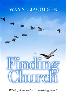
Of the three possibiities I most like the geese formation. Just the nature and character of the Canada Goose with its sense of loyalty and community, and here is a lone goose not flowing with the formation/organization. Those of us who have diverted from the ‘conventional’ formation are like that lone goose, catching a different current, in sight of the others. It matters not the mechanism that brought us to that phase of our journey, but like these geese flying in formation on their journey, it is about our God journey.
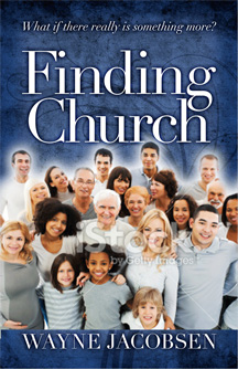
My second choice doesn’t speak in such a multiple or wider thought manner to me. The photo of the group of people does speak inclusion of all people. It just doesn’t inspire thoughts of this journey Papa has us on in finding real church.
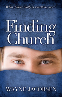
The third photo doesn’t connect the title to the subject in a way that would capture my attention had I not been familiar with the conversation you have been participating in with others likewise journeying.
Great cover design on all of them! The one I prefer is the goose formation – just something more “freeing” and artistic about that picture than the usual people-on-the-cover style. I love the geese analogy in that there isn’t a “single leader of the pack” but each goose takes its turn, fighting the headwind, protecting the ones behind it, then steps back to let others take that spot – a great analogy in that we’re all brothers and sisters, helping each other find our way home. I’m in great anticipation of your next release, Wayne!
Of the three possibiities I most like the geese formation. Just the nature and character of the Canada Goose with its sense of loyalty and community, and here is a lone goose not flowing with the formation/organization. Those of us who have diverted from the ‘conventional’ formation are like that lone goose, catching a different current, in sight of the others. It matters not the mechanism that brought us to that phase of our journey, but like these geese flying in formation on their journey, it is about our God journey.
My second choice doesn’t speak in such a multiple or wider thought manner to me. The photo of the group of people does speak inclusion of all people. It just doesn’t inspire thoughts of this journey Papa has us on in finding real church.
The third photo doesn’t connect the title to the subject in a way that would capture my attention had I not been familiar with the conversation you have been participating in with others likewise journeying.
Great cover design on all of them! The one I prefer is the goose formation – just something more “freeing” and artistic about that picture than the usual people-on-the-cover style. I love the geese analogy in that there isn’t a “single leader of the pack” but each goose takes its turn, fighting the headwind, protecting the ones behind it, then steps back to let others take that spot – a great analogy in that we’re all brothers and sisters, helping each other find our way home. I’m in great anticipation of your next release, Wayne!
The flying geese cover strikes a chord with me. However the flying as a flock ( typical of geese) does not seem appropriate, as it seems to me. Many of us have left “our flock” and have been taken so very typically as individuals and couples out of our church or flock, and remain so subject to our past even as God in Jesus is doing this “rewiring”. Just a thought. Love reading this sort of stuff – thank you.
The flying geese cover strikes a chord with me. However the flying as a flock ( typical of geese) does not seem appropriate, as it seems to me. Many of us have left “our flock” and have been taken so very typically as individuals and couples out of our church or flock, and remain so subject to our past even as God in Jesus is doing this “rewiring”. Just a thought. Love reading this sort of stuff – thank you.
I like the third one best out of the three options. The ducks definitely is a no-go, the eyes concept could be interesting but rather point to searching, or anonymity. This one SHOWS “church found…”
Hope this helps!
Blessings,
Andre
I like the third one best out of the three options. The ducks definitely is a no-go, the eyes concept could be interesting but rather point to searching, or anonymity. This one SHOWS “church found…”
Hope this helps!
Blessings,
Andre
Love the geese cover. There’s an inner compass in us that will take us home, if and when we let it do its work.
There’s an inner magnet that automatically draws us toward one another when we stop trying to force it.
I like the cover with the group of people standing next to each other. Geese find their way home by instinct. People find their way home by listening to God’s voice and responding to it. The people on the third cover look like they love Jesus and one another. Isn’t this what the church is all about? It’s the simplicity of just gathering together, touching Christ in one another and allowing the Lord to build his church in ways that are outside of any conventional definition of church as we know it. It’s simply the wonder of his ways in connecting his children to one another.
Love the geese cover. There’s an inner compass in us that will take us home, if and when we let it do its work.
There’s an inner magnet that automatically draws us toward one another when we stop trying to force it.
What about a cover with all kids . Even us adults would like to play freely like kids. In the middle of the front have a group of kids freely playing in a pond or playground or yard and then a fence and then a kid or two peering through the fence from the spine of the book or even from around the back cover. It could be a photo or even a Norman Rockwell ish watercolor. I bet Chris Grahl could do a great watercolor for you.
Hello Wayne,
Nice covers, but since you are asking, I guess I really don’t feel that either of the three live up to your book. If I know you enough and the heart of what the Church is all about (we, the grand community of believers, organically spread across the world, sharing one heart towards Jesus as our Lord and Savior), I feel like another design entirely may be more fitting.
How about a cover with a man (perhaps you, yourself) talking to a couple, at a quaint table tucked away in the nook of a coffee shop. Perhaps a laptop is pushed to the side, there’s a bible on the table, too, but it also may be pushed aside, but “ready” to be picked up and read, if the conversation so leads. All 3 parties are sipping coffee, perhaps one has a pastry. All three exude comfort and security, relationship and engagement. All three are engaged in an authentic conversation with another.
Something like that to me, more reflects what and how one aspect of “Church” may be. Putting myself in someone’s shoes, either who may not be a believer, or perhaps someone with the traditional idea of institutional church, yet beginning to question the system, and this person was walking down the aisle of a bookstore or shopping online and stumbled upon the cover of “Finding Church” which had the cover I described above, I think that person would be drawn and curious. Why? Because their previous concepts might be challenged, or perhaps their heart would be drawn because the cover would more accurately depict what the true Church can look like.
P.S. I’m delighted that your book is coming along so well, and in the cover stage. You can bet I’ll be quick to purchase it once it’s published. Secondly, I am praying for you and your parents while you are in Fresno with them.
Blessings to you, from a friend,
Amy in Phoenix, AZ
Blog: http://www.embraceyourbeautifulbody.com
I like the cover with the group of people standing next to each other. Geese find their way home by instinct. People find their way home by listening to God’s voice and responding to it. The people on the third cover look like they love Jesus and one another. Isn’t this what the church is all about? It’s the simplicity of just gathering together, touching Christ in one another and allowing the Lord to build his church in ways that are outside of any conventional definition of church as we know it. It’s simply the wonder of his ways in connecting his children to one another.
The goose one. Doesn’t the book point to something more that can only be understood by following him. The third one reminded me of too many brochures that “happy” “church” organisation it try to represent.
The first one definitely! Helps people explore further…. The 3rd one with all the people reminds me too much of the squeeky clean image that many churches love to promote…Notice there is no one with bad teeth in this photo!
What about a cover with all kids . Even us adults would like to play freely like kids. In the middle of the front have a group of kids freely playing in a pond or playground or yard and then a fence and then a kid or two peering through the fence from the spine of the book or even from around the back cover. It could be a photo or even a Norman Rockwell ish watercolor. I bet Chris Grahl could do a great watercolor for you.
Hello Wayne,
Nice covers, but since you are asking, I guess I really don’t feel that either of the three live up to your book. If I know you enough and the heart of what the Church is all about (we, the grand community of believers, organically spread across the world, sharing one heart towards Jesus as our Lord and Savior), I feel like another design entirely may be more fitting.
How about a cover with a man (perhaps you, yourself) talking to a couple, at a quaint table tucked away in the nook of a coffee shop. Perhaps a laptop is pushed to the side, there’s a bible on the table, too, but it also may be pushed aside, but “ready” to be picked up and read, if the conversation so leads. All 3 parties are sipping coffee, perhaps one has a pastry. All three exude comfort and security, relationship and engagement. All three are engaged in an authentic conversation with another.
Something like that to me, more reflects what and how one aspect of “Church” may be. Putting myself in someone’s shoes, either who may not be a believer, or perhaps someone with the traditional idea of institutional church, yet beginning to question the system, and this person was walking down the aisle of a bookstore or shopping online and stumbled upon the cover of “Finding Church” which had the cover I described above, I think that person would be drawn and curious. Why? Because their previous concepts might be challenged, or perhaps their heart would be drawn because the cover would more accurately depict what the true Church can look like.
P.S. I’m delighted that your book is coming along so well, and in the cover stage. You can bet I’ll be quick to purchase it once it’s published. Secondly, I am praying for you and your parents while you are in Fresno with them.
Blessings to you, from a friend,
Amy in Phoenix, AZ
Blog: http://www.embraceyourbeautifulbody.com
The goose one. Doesn’t the book point to something more that can only be understood by following him. The third one reminded me of too many brochures that “happy” “church” organisation it try to represent.
The first one definitely! Helps people explore further…. The 3rd one with all the people reminds me too much of the squeeky clean image that many churches love to promote…Notice there is no one with bad teeth in this photo!
I like the geese cover. They are on a journey and we are on a journey. They are not wandering aimlessly they are going in a specific direction. They are following an interior compass as we are following an interior compass called the Spirit. It may seem at times that we are wandering aimlessly but the Spirit is leading us in a specific direction.
I like the geese also but lean a bit in favor of the people. I love seeing the children in there … They are so over looked and many times put in other rooms so the grown ups can have “church” without them there. Then again I would read it with no cover at all as I’m looking forward to the content so much !! So don’t go by me lol.
The third cover with people from young to old and various cultures. The picture shows no boundaries. However, the meaning of faint white letters spelling “stock” (on my screen) toward the bottom eludes me.
I like the geese the best because of the metaphor, but I honestly feel that there is no “wow” factor in either 3, nothing that would make me want to pick the book up and read it. This won’t be a “typical Christian” book, so I think if possible it would be neat for the cover to reflect that? (Sorry, I don’t have any other great ideas, just my comment). Thanks.
I love the flying geese…I used to be in that formation, just following the leader to who knows where. There was some changing of leaders…but I still had no idea where I was going or who got to choose the course. I had to leave the ease of flying in formation in search of the real church, and naturally the course requires more effort if nobody breaks the trail. But thats where I learned to follow my heart into the arms of our Father. I still don’t really trust a group of smiling people…
Just my two cents worth on this journey of finding church…
Hi. I really like the geese formation one. It is simply beautiful, reflects freedom and voluntary co-operation.
Hi Brother Wayne,
The top left cover shows me a goose that is away from the other geese. It may be missing out, because it is not flying with the other geese.
The bottom cover shows me people together. The church is built through friendships and relationships.
I am not in favor of the top right cover.
Best regards,
Kendon Light
Geese cover: Good concept. It speaks of family & community – all are equal, beneficial and required. Not sure whether it should have the lone goose at the front though – I’ve attended a few ‘clubs’ with a prominent lone goose at the front – I think the cover needs to stay clear of any hint towards a required ‘man of god’ leader.
Also (as a fellow designer) – would suggest not using white with outer shadow text for the title – a solid dark blue will be clearer on a shelf and won’t ‘date’ stylistically. (apologies if I am begin presumptuous here – Dave’s doing a great job!)
Eye’s cover: I find a little weird and creepy… not sure what it is ‘saying’
People cover: A nice concept. It sends the right message, but IMO the image seems a little fake and ‘stock imagey’ (too many white/perfect teeth)
Great work Wayne!!
The eyes draw me in since that is what I was like, searching. My relationship with Father, Jesus and Spirit has become my focus not attending a “church/congregation”. As I sense more of Father’s love for me and embrace that reality the more I trust him. I find it makes life so much more interesting (notice I don’t say easy).
I prefer unconventional. So of the three I prefer cover #1. Also a designer, I tend to agree on Dan’s comment about white type and shadow. The whole cover feels light weight with no strong focal point and the white shadowed type simply adds to that problem. A solid type would work better in my opinion. However I am not sure you have fully captured the heart of the seeker with this cover. I wonder if a goose perched on the letters would be a possible idea. One who has stopped flying because it is taking a break and reassessing whether the journey that everyone else is on is going in the right direction. Facing the opposite direction. Getting off the band wagon. The other image that comes to me is a fish swimming upstream.
The eyes reminds me of other covers I have seen, including one dealing with purity of eyes and deals with pornography. http://www.amazon.ca/Eyes-Honor-Training-Purity-Righteousness-ebook/dp/B00817LQKM/ref=sr_1_1?ie=UTF8&qid=1406905721&sr=8-1&keywords=eyes+of+purity
Perhaps if the eyes were looking off to the side it would make it look like someone is looking for something.
The 3rd cover is so cliché that is actually turns me off and I would not buy it based on the cover. It is indeed a stock photo type image and feels terribly generic to me. As a designer, I have used this type of image to denote “real” church that is open to everyone, plus health agencies, and the like. Although the image is perhaps accurate in its diversity, the history of its usage for me makes it feel insincere for your application. However, it may work for the church masses who still buy into this type of thinking and then get a wonderful surprise as they read it. Who is your audience? I do not think it is the church masses but the seeker.
I like the 3rd one, that shows community. I really don’t see the geese as really connecting with the title. I really like the love and diversity (age, gender, culture/race) shown amongst those pictured on the third cover, which seems to be absent on the 2nd cover.
I like the 3rd one, that shows community. I really don’t see the geese as really connecting with the title. I really like the love and diversity (age, gender, culture/race) shown amongst those pictured on the third cover, which seems to be absent on the 2nd cover.
The one with people. They look friendly and like a diverse family group.
I like the birds but the ‘V’ pattern of flying geese is too rigid and regemented I think. Reminds me of institutional church with one leader. I like the idea of birds but prefer the image of a murmuration better with its beautiful free flowing movements that still maintains unity. The murmurmation doesn’t follow along with the ‘lone goose’ however. I know you asked for an opinion on the three options given, but they really don’t thrill my heart. Seem rather bland actually (sorry if that was too blunt). The murmuration reminds me of the free flow of the Holy Spirit and the unity of the body as they move together.
My other suggestions would be for the subtitle to be enlarged, bolded, and moved up closer to the title. I think this would catch the eye better and communicate a single idea rather than appearing as an afterthought.
Thank you for the opportunity to share. I hope the suggestions were helpful.
I really like the “Geese” cover. To me it signifies that sometimes, breaking away from the “group” is the only way to discover the truth. I can’t wait to read this latest output from Wayne… no matter what cover you choose…
Bob
Wayne, definitely the geese. Migrating away from bondage. The path away from the flock means we have to work harder, but it is with God’s help, not that of the others, that brings us into a new reality.
I like the group of people together best. It visually grabs me before the birds do, and it represents church as a family.
However, if the birds cover could be adjusted to grab the attention more, it might help. I like the concept of pulling away from the formation. The way it is now, my eyes would pass over it on a bookshelf.
I like the third one showing people .. because it represents church as family …
Greetings from Germany
I like the third one showing people .. because it represents church as family …
Greetings from Germany
Of the three, I prefer the geese. The one with the people does not really reflect a great deal of diversity, and that bothers me. Also, I agree that it looks like many church promotional brochures I’ve seen over the years. I instantly get a gut reaction to it that I probably wouldn’t fit in with those people. The geese imply the questions that the book chapters address. How do I belong to the church God is building without getting stuck in a routine and expectaion of roles? Can I navigate this journey without a human leader? Where do I go from here?
Of the three, I prefer the geese. The one with the people does not really reflect a great deal of diversity, and that bothers me. Also, I agree that it looks like many church promotional brochures I’ve seen over the years. I instantly get a gut reaction to it that I probably wouldn’t fit in with those people. The geese imply the questions that the book chapters address. How do I belong to the church God is building without getting stuck in a routine and expectaion of roles? Can I navigate this journey without a human leader? Where do I go from here?
I like the one with birds. Honestly I feel like all the covers convey the same-old-same-old religious book cover design and I’d encourage your graphic design to dig deeper. Maybe think less literally and look to the world of fine art for inspiration. I think the white male eyes gazing happily through a cutout is generic and too white-male centric. I think the suspiciously in-authentic multi-cultural gathering harkens too much to a time when the church meant physical gatherings of like-minded people and if there’s one thing I know from the God Journey it’s church happens all over the place when you’re least expecting it and it doesn’t always look like the picture in your head.
I’m so excited about this book, just the first chapter you read give me so much hope, peace and freedom to keep on this journey even though other Christians in my life might think I’m not “ok.” God loves me a lot and has might right where he wants me and that’s all that matters.
My suggestion, as a graphic designer, avoid stock art, and look into originals illustrations, I might suggest Sean K. Sutter, he’s amazing. Stock art screams phony and finding church should be as far from phony as possible.
Honestly I’d like a simple blue or green cover with white text in Futura… that is all. Simple, true, honest. No gimmicks. Read the book, draw your own conclusions.
I hope your designer doesn’t take this criticism poorly, honestly I’d probably turn to stock art too if I was tasked with designing this cover. But the book is about authenticity and stock art isn’t. All those happy smiling people on that cover, that’s not what this book promises, it’s about freedom in Christ at the risk of distancing all the happy smiley church people you held dear.
Or maybe I’m just tainted right now because I’m in the desert. But please, just no stock photography. Please!
None of the above, but… I’D GO MORE RELATIONSHIP THAN JOURNEY WITH THE COVER and I’m not sure any of the 3 really communicate that, even the group of people. It’s actually way too “churchy!” I want to pick the group of people because that’s what the church is, but it is way too “stock” photography and a pretty cheesy pic, and your book content is NOT! The eyes caught my attention the most to be sure, but I really don’t know what you’re trying to communicate there and am left to guess too much and I don’t think it works. The geese are a bit too expected and unoriginal and don’t really make me want to read the book (which I think a cover should help with…like The Shack). Geese communicate journey, which is good, but not so much relationship. Soooo…I would lean more towards what another person posted. How about a pic of a conversation in Sarah’s garden, or at the dinner table with dishes pushed to the side, or at a coffee shop…or wherever. Something that communicates relationship, people engaging each other. The coffee shop pic could communicate a light atmosphere, but have the people’s faces appear to be in deep and real conversation. If it was 3 people, 2 people could be looking at each other, one talking, and the third looking at the speaker. So I’d go more for RELATIONSHIP than journey with the cover. And I agree with the designers comments on the text.
None of the above, but… I’D GO MORE RELATIONSHIP THAN JOURNEY WITH THE COVER and I’m not sure any of the 3 really communicate that, even the group of people. It’s actually way too “churchy!” I want to pick the group of people because that’s what the church is, but it is way too “stock” photography and a pretty cheesy pic, and your book content is NOT! The eyes caught my attention the most to be sure, but I really don’t know what you’re trying to communicate there and am left to guess too much and I don’t think it works. The geese are a bit too expected and unoriginal and don’t really make me want to read the book (which I think a cover should help with…like The Shack). Geese communicate journey, which is good, but not so much relationship. Soooo…I would lean more towards what another person posted. How about a pic of a conversation in Sarah’s garden, or at the dinner table with dishes pushed to the side, or at a coffee shop…or wherever. Something that communicates relationship, people engaging each other. The coffee shop pic could communicate a light atmosphere, but have the people’s faces appear to be in deep and real conversation. If it was 3 people, 2 people could be looking at each other, one talking, and the third looking at the speaker. So I’d go more for RELATIONSHIP than journey with the cover. And I agree with the designers comments on the text.
The Geese is by far the best because I have long understood the dynamics of geese in flight and how while it may look hierachetical it really isn’t, they are holding each other up. But what really clinches it for me is the subtitle What if there really is something more? There just has to be!
Please get this published soon . Blessings.
PS, Can I preorder?