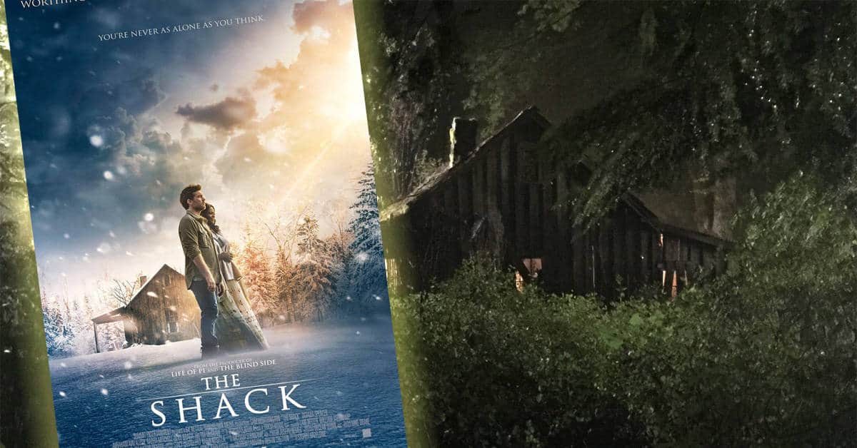
For those following our development of a cover for The Shack, we have another incarnation to show you. If you’d care to comment, we’d sure appreciate your input.
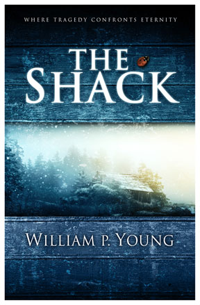


For those following our development of a cover for The Shack, we have another incarnation to show you. If you’d care to comment, we’d sure appreciate your input.
Comments are closed.
Wayne,
I think I prefer a combination of the first incarnation and this one. I like the first one better, except for the black is too dark. If that were more of a blue like this one it would suit me better….and after all, it is all about me, isn’t it? 😉
– Kevin
I really like this version! The shack looks totally overgrown and abandoned, and I like the sub (super?) title. As a reader, I would definitely pick it up.
Yeah- I’d pick this up off the shelf to further inspect. Graphics are fetching with a little mystery. 🙂 Can hardly wait to get my hands on a copy!
Beautiful! It has a sense of mystery, the picture reminds me (positively!) of the snowy landscape of the narnia movie. To me this looks so much better than the previous one. More colors and no ‘life-changing comments’. Great!
Wayne,
I think I prefer a combination of the first incarnation and this one. I like the first one better, except for the black is too dark. If that were more of a blue like this one it would suit me better….and after all, it is all about me, isn’t it? 😉
– Kevin
I asked my 28 year old daughter which book cover she liked better, (not knowing a thing about the book) and she said she’d more likely pick up the book with THIS cover for the other one seemed like it would be about something scary. As for me, I thought I liked the other one better but I KNOW no matter what the cover looks like, it will be good. I now “see” it through my daughter’s eyes and I’d have to agree with her. Eager for the release!
I really like this version! The shack looks totally overgrown and abandoned, and I like the sub (super?) title. As a reader, I would definitely pick it up.
Yeah- I’d pick this up off the shelf to further inspect. Graphics are fetching with a little mystery. 🙂 Can hardly wait to get my hands on a copy!
I love this cover, way to go!!! I think it improves 100% over the first one. It’s got the old rustic feel, this one def. gets my vote.
Beautiful! It has a sense of mystery, the picture reminds me (positively!) of the snowy landscape of the narnia movie. To me this looks so much better than the previous one. More colors and no ‘life-changing comments’. Great!
I asked my 28 year old daughter which book cover she liked better, (not knowing a thing about the book) and she said she’d more likely pick up the book with THIS cover for the other one seemed like it would be about something scary. As for me, I thought I liked the other one better but I KNOW no matter what the cover looks like, it will be good. I now “see” it through my daughter’s eyes and I’d have to agree with her. Eager for the release!
I love this cover, way to go!!! I think it improves 100% over the first one. It’s got the old rustic feel, this one def. gets my vote.
I like this one much better. The blue is less harsh than the black cover. The light looks wholesome. The cover is mysterious without being scary. The shack is barely visible, but it’s good that it’s overgrown and looks abandoned. The simple header ‘Where Tragedy Confronts Eternity’ adds to the mystery and is much better than the oversell on the previous cover.
I like this cover overall, but am wondering about the ladybug….I find it distracting, both to the eye and the tone of the cover. Or does it have significance to the contents?
I\’d definitely pick it up. Very attractive cover; prefer it to the first; more subtle, more inviting. Good work.
Really like this one, it tells me just enough but still leaves me intrigued. It’s sightly more subtle. Definitely my personal preference. Think it would go better than the first one here in Australia?
I really liked the first one better. That’s not to say that this one is not good. I liked the first one better because of the light shinning on the old shack. Sorta like Jesus shinning on me. He is converting this old shack into something better.
I like the first one much better! This one is too plain and vague! I do like the line at the top though – combine that with the first cover IMO
I have to agree with the people who like this one better. The blue tone plus the texture of the wood draw my eyes in more closely (black is cool, but drawing in the eyes more is better).
I like the “super-title” at first glance, and it makes me interested to further investigate. But at second glance, I question the word: “eternity.” Who really says “eternity” or reads books about it? Could it say: “immensity” or something else? Not a big deal overall.
I like how the light and darkness in the image seem to blend with the diagonal line separating them (and snow visible in the margins). It’s mysterious and feels important without being so “in your face” as a beam of light from heaven.
The ladybug doesn’t bother me. I assume it symbolizes something in the story, or it’s a symbol used in the story. It never hurts to have a little bit of “blood red” on the cover either. Anyway, it has been toned down since the first version and blends more with the background.
Oh yeah, that’s it! You’ve got the right elements in visually appealing colors, still have the light but it doesn’t look scary. I love the “Where Tragedy Confronts Eternity” as it gives a hint of a spiritual event and I like it much better without that quote at the bottom. The lady bug fits well in this desgin.
Oh yeah, that’s it! You’ve got the right elements in visually appealing colors, still have the light but it doesn’t look scary. I love the “Where Tragedy Confronts Eternity” as it gives a hint of a spiritual event and I like it much better without that quote at the bottom. The lady bug fits well in this desgin.
Ok, the first one was more eye catching, more dramatic. I thought it almost cheesey (Depending on your audience this could be good or bad 🙂 ) This one is more subtle. The title stands out more making the words draw you in instead of the picture. I like the second one better but I’m not sure it would “grab” me. 31 year old female
Ok, the first one was more eye catching, more dramatic. I thought it almost cheesey (Depending on your audience this could be good or bad 🙂 ) This one is more subtle. The title stands out more making the words draw you in instead of the picture. I like the second one better but I’m not sure it would “grab” me. 31 year old female
Well, if you were going for a more mainstream Christian cover art, I’d say you found it. The darkness quotient looks better suited for a “dangerous sleigh ride to the relatives'” than the kidnapping and murder of a daughter, though.
And, even as a Christian, I’m tired of buzz-words like “eternity”, especially if it is, as I suspect, code for “God”. God is not eternity, and I don’t really find the word “eternity” any less religious sounding anyway.
I guess I sound pretty negative…I’m not very old (28) and my love of the liberal arts does not help me to be more charitable towards what I perceive as the inferiority of (most) art (of all varieties) produced by Christians.
Second cover is much better, more subtle, cleans off the “sell” and the rainbow beams…keep the ladybug! -pablo
Second cover is much better, more subtle, cleans off the “sell” and the rainbow beams…keep the ladybug! -pablo
Wayne, I prefer this one much better… I think it’s a little less revealing and pardon me if I am rude, a little less “cheesy.”
Wayne, I prefer this one much better… I think it’s a little less revealing and pardon me if I am rude, a little less “cheesy.”
I like the a-bit-more macabre image of the shack in Ver. 1, but the font and titling looks better on this one. Although, it may make more sense to have the “where tragedy confronts eternity” line below “The Shack” (just grammatically, because then the description comes AFTER the antecedent of the line). Something about this looks more “professional” than Ver. 1.
I will say that the title over horizontal bands, with an image between the bands, and the author name below it… reminds me (at first blush) of the layout of the Left Behind books. Just a thought.
My comments on the first cover design were a little critical and are already documented so I won’t rehash them here. What I want to say though is that this cover is much better – the gradation of tones is more pleasing and it just seems to be a more cohesive graphic. I like the idea of the wood planks – to me it is evocative of looking through a fence into a place which is a bit forbidding but also suggestive that something of significance was once there.
Also, I can see a commercial opportunity for Brad – does that roof need fixing or what?